Pages

Showing posts with label Color. Show all posts

Wednesday, September 2, 2015

A Grey Bedroom.

This week marks 8 months since I have moved into my new home and I have finally decided to take on the task of painting my bedroom. I absolutely love grey bedrooms and have been looking for inspiration. My ceilings (like many condos downtown) are concrete and I want to be sure grey walls and a concrete ceiling does not make my room feel cold. A bedroom should feel warm and comfortable as it is the place of rest in the home. 

A number of the grey bedroom that I have looked at feel incredibly austere to me. As I gathered inspiration, I found that a lot of grey bedrooms that I gravitated toward included a natural wood element. Adding feature made out of wood to a grey room is a great way to balance out the cold feeling of grey can sometimes elicit.


How do you counterbalance grey in your home? 

In addition to writing for Daigle's Digs, Elizabeth works full-time as a Real Estate Agent with  Keller Williams Realty Downtown, LLC. Elizabeth's expertise is in buying and selling a home, first time home buyers, luxury, and investment properties. Contact Elizabeth for any real estate needs. Cell 303-819.73.71. Work 720-314-8352.


Monday, July 13, 2015

Gold Fixtures

One of the hottest trends of 2015 is gold fixtures, especially in the kitchen and bathroom. My love for gold runs deep so I love this trend. 


What do you think about gold fixtures? Would you do it in your home? I most definitely would, although, my home currently came equip with all silver fixtures. I will not be switching the fixtures out anytime soon and get my gold fix through pictures. 


In addition to writing for Daigle's Digs, Elizabeth works full-time as a Real Estate Agent with  Keller Williams Realty Downtown, LLC. Elizabeth's expertise is in buying and selling a home, first time home buyers, short sales, and investment properties. Contact Elizabeth for any real estate needs. Cell 303-819.73.71. Work 720-314-8352.


Monday, July 6, 2015

Rugs on Carpet.

The concept of layering is often talked about in design. Layering can create the room with the right amount of texture, color, shape and light. One mode of layering is using rugs as it helps bring texture and color into the room. Many people shy away from putting a rug on carpet but it is a great way to layer and break up a large carpeted room. 

1. It can define a space in a large room.


 2. Provide a softer surface for your feet to land. 


 3. Rugs can add color and texture to a room.


4. Also, rugs are a great way to hide a carpet stain. 


What do you think? Do you like area rugs on carpet? 

In addition to writing for Daigle's Digs, Elizabeth works full-time as a Real Estate Agent with  Keller Williams Realty Downtown, LLC. Elizabeth's expertise is in buying and selling a home, first time home buyers, short sales, and investment properties. Contact Elizabeth for any real estate needs. Cell 303-819.73.71. Work 720-314-8352.

Wednesday, June 3, 2015

Color Me: Coral

We finally have sun here in Denver! It seemed like for two months straight we had grey clouds and rain. This nice (typical) warm weather and lots of sun makes me happy. Through all of this rain I found myself getting a lot of use out of my coral raincoat and anywhere I went I always got a compliment on the coat. I am sure it was because the color stood out amidst the grey clouds. What color is more cheery than coral? Wondering how to incorporate coral into your house? Here are some great examples:

 Sources going clockwise: 1 2 3 4

Counsidering painting a wall coral? Use some of these paint color ideas.  


How do you feel about the color coral in the home? 

In addition to writing for Daigle's Digs, Elizabeth works full-time as a Real Estate Agent with  Keller Williams Realty Downtown, LLC. Elizabeth's expertise is in buying and selling a home, first time home buyers, short sales, and investment properties. Contact Elizabeth for any real estate needs. Cell 303-819.73.71. Work 720-314-8352.
 

Monday, May 18, 2015

Black Trim

Looking to make a striking statement in your home? Consider painting your interior window trim black. Black trim accentuates the windows making them look like a feature of the room. 


How do you feel black trim for the windows? 

In addition to writing for Daigle's Digs, Elizabeth works full-time as a Real Estate Agent with  Keller Williams Realty Downtown, LLC. Elizabeth's expertise is in buying and selling a home, first time home buyers, short sales, and investment properties. Contact Elizabeth for any real estate needs. Cell 303-819.73.71. Work 720-314-8352.

Friday, April 24, 2015

Benjamin Moore: Blue Danube

Have you seen Benjamin Moore Color Trends for 2015? It is a great starting point if you are considering painting a room and unsure what color to use. Colors on this list range from neutrals, dark, cool and warm. Recently I painted an accent wall in my living room Blue Danube, a 2015 color trend. 


Blue Danube is a rich, bold blue that compliments cool colors and neutrals well. Choosing a paint color is always nerve-wracking as you have to envision the paint color in the room prior to actually painting it. I find searching Pinterest for the paint color helps because you can often find rooms painted the color already. 

Rooms that were painted Blue Danube and I used as inspiration: 


Wondering what my finished product came out as? Go here to see it.

In addition to writing for Daigle's Digs, Elizabeth works full-time as a Real Estate Agent with  Keller Williams Realty Downtown, LLC. Elizabeth's expertise is in buying and selling a home, first time home buyers, short sales, and investment properties. Contact Elizabeth for any real estate needs. Cell 303-819.73.71. Work 720-314-8352


Friday, March 20, 2015

The Use of Navy Blue

I have been doing a lot of research on branding which has led me to information how colors can elicit a certain type of emotional response. Without going into about my own personal branding strategy (more to come!), I have been looking into the color navy blue. Of course, it is no secret that I love navy and would much prefer navy over black or brown any day. 

The color navy blue originally got its name from the British Royal Navy as the men wore dark blue uniforms contrasted with white. Psychologically, the color blue is associated with trust and responsibility. 
 Blue represents:
  • Communication
  • Peace and calm
  • Honesty.
  • Authority (the darker the shade of blue, the more authority is represents).
  • Religion
  • Wisdom
"Dark Blue: Dark blue is the color of conservatism and responsibility. Although it appears to be cool, calm and collected, it is the color of the non-emotional worrier with repressed feelings, the pessimist and the hypocrite. Dark blue can be compassionate but has trouble showing it as its emotions run deep. Dark blue is a serious masculine color representing knowledge, power, and integrity, and is used quite often in the corporate world."

How can you use this information? Knowing the meaning and emotions behind a certain color can help in branding, in my current case, it can also be helpful to know when choosing colors to use in a room. When choosing a color scheme or paint color for a room you can of course chose the color that speaks to you. Another approach would be determine the 'feeling' you want a person to feel while in the room. If you would like a room to feel peaceful, wisdom (such as a library) or elicit a feeling of open communication - blue might be a great color to chose. Interesting enough, when I went looking for pictures of rooms that use navy, I found a lot of living rooms, bathrooms and libraries. 

Pottery Barn

Cory Connor Designs

HGTV

Contemporary living room by Lisa Patrole Photography

What does navy blue mean to you? What room would you paint navy?

In addition to writing for Daigle's Digs, Elizabeth works full-time as a Real Estate Agent with  Keller Williams Realty Downtown, LLC. Elizabeth's expertise is in buying and selling a home, first time home buyers, short sales, and investment properties. Contact Elizabeth for any real estate needs. Cell 303-819.73.71. Work 720-314-8352


Monday, December 8, 2014

The Indigo Grand Sofa

I have been searching for a new sofa and found this absolutely gorgeous sofa. Oversized, casual and comfortable, the Indigo Grand Sofa at Crate in Barrel, is a statement piece for any large living area. To me, this couch just screams "come lay down and relax". Crate and Barrel's description of the couch says it best:

"Paola Navone's Indigo sofa has a soft, casual structure for the ultimate sink-in, cocooning experience. Not your conventional sofa, two loose bolsters stack as "arms" at each end of a long, premium down-filled bench cushion, and seven back feather-down pillows toss, nestle and layer. Washed 100% linen slipcover with contrasting jumbo edge-stitching is the natural choice for this fashionably slouched look. Beneath that casual attitude is a serious sinuous wire suspension—the gold standard for comfort— that supports and conforms to your every move, from upright sitting to downright napping."


Would you purchase this sofa? 

In addition to writing for Daigle's Digs, Elizabeth works full-time as a Real Estate Agent with Keller Williams Realty Downtown, LLC. Elizabeth's expertise is in buying and selling a home, first time home buyers, short sales, and investment properties. Contact Elizabeth for any real estate needs. Cell 303-819.73.71. Work 720-314-8352.

Monday, December 1, 2014

A modern spin on subway tiles.

Subway tiles have become quite popular in both bathrooms and kitchens. Subway tiles can be glass, porcelain or ceramic and it offers a fresh, clean look. Commonly, subway tiles are white but can be different colors. This picture showcases a bathroom's backsplash with purple subway tiles. This is a great option to bring some color into a room. 


What do you think? Would you do a purple backsplash? 

In addition to writing for Daigle's Digs, Elizabeth works full-time as a Real Estate Agent with Keller Williams Realty Downtown, LLC. Elizabeth's expertise is in buying and selling a home, first time home buyers, short sales, and investment properties. Contact Elizabeth for any real estate needs. Cell 303-819.73.71. Work 720-314-8352.

Wednesday, November 19, 2014

Pink + Red

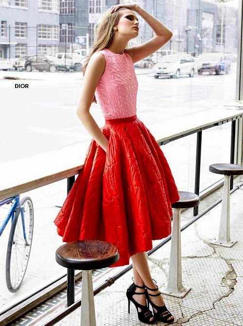
Last week I spoke about navy and black matching and I thought of the other color combinations that I have been seeing that have clashed in the past. Pink and red is one of those combinations. I have seen the color put together recently and I really the combination. I particularly like red and pink together in outfits: 

Alla Kostromichova by Patric Shaw for Marie Claire UK August 2014

Although, I have seen a lot of pink and red in homes and love the look as well. There are many ways to incorporate pink and red into your home.

Pink with pops of red.

Bring in a rug with red and pink.


The artwork in these room brings together pink and red. 


How do you feel about red and pink together? Do you like it or do you still feel like it clashes? 


In addition to writing for Daigle's Digs, Elizabeth works full-time as a Real Estate Agent with Keller Williams Realty Downtown, LLC. Elizabeth's expertise is in buying and selling a home, first time home buyers, short sales, and investment properties. Contact Elizabeth for any real estate needs. Cell 303-819.73.71. Work 720-314-8352.


Wednesday, November 12, 2014

Navy and Black

Black and navy. Once a style no-no is now becoming a very popular combination. Black and navy paired together can create a very powerful combination in both fashion and the home.
How do you feel about black and navy together? Would you do it? I am not usually a person to adhere to style rules and much prefer to march to the beat of my own drum. Although, navy and black is the one fashion rule I did follow and I am very happy it no longer seems to be a faux pas. 

In addition to writing for Daigle's Digs, Elizabeth works full-time as a Real Estate Agent with Keller Williams Realty Downtown, LLC. Elizabeth's expertise is in buying and selling a home, first time home buyers, short sales, and investment properties. Contact Elizabeth for any real estate needs. Cell 303-819.73.71. Work 720-314-8352.


Friday, November 7, 2014

Neutrals and Texture

Lately I have been gravitating towards a neutral color scheme. I think neutrals can pack a very huge punch in a home. Not only is it very versatile but it keeps the home looking pristine. Here I spoke about about the use of the color white in homes and how texture plays a big role in docrating with a neutral color scheme.  

I wanted to talk a little further about texture in the home. The easiest way to describe texture in interior design terms is anything that has movement and looks like it was be interesting to touch. Adding texture into a room can make the room feel very cozy, which is why it is great to partner with neutrals. A neutral room without texture can appear very sterile whereas if you add texture to the room the eye something interesting to look at. 

There are a number of ways to incorporate texture into a room. Adding wood and wood elements is one of my favorite ways to incorporate texture into a neutral room.


 Do you like the look of neutrals and wood? What other elements do you like to incorporate into a room to add texture?


In addition to writing for Daigle's Digs, Elizabeth works full-time as a Real Estate Agent with Keller Williams Realty Downtown, LLC. Elizabeth's expertise is in buying and selling a home, first time home buyers, short sales, and investment properties. Contact Elizabeth for any real estate needs. Cell 303-819.73.71. Work 720-314-8352.


Wednesday, October 29, 2014

Pink in the Home

In honor of Breast Cancer Awareness month I thought I would put together some images of pink IN THE HOME. I have never been a huge 'pink' girl, opting for a peach color bedroom instead of a pink even as a young girl. That being said, I have seen some great ways to use pink in the home and make it look good. I opt for using pink sparingly in design as I feel even the softest of pinks can make a huge impression but that does not always need to be the case. A room full of pink can work if done right. 


Since I have never used a lot of pink I thought it was interesting to find out the meaning of the color pink:

"In color psychology, pink is a sign of hope. It is a positive color inspiring warm and comforting feelings, a sense that everything will be okay.

Pink calms and reassures our emotional energies, alleviating feelings of anger, aggression, resentment, abandonment and neglect. Studies have confirmed that exposure to large amounts of pink can have a calming effect on the nerves and create physical weakness in people. Violent and aggressive prisoners have been successfully calmed by placing them in a pink room for a specified amount of time. Exposure for too long can have the opposite effect.
"

After reading this it is no wonder the breast cancer awareness ribbon is pink. I always thought the reason  itwas because pink was often associated with femininity but rather it is a sign of hope. 


In addition to writing for Daigle's Digs, Elizabeth works full-time as a Real Estate Agent with Keller Williams Realty Downtown, LLC. Elizabeth's expertise is in buying and selling a home, first time home buyers, short sales, and investment properties. Contact Elizabeth for any real estate needs. Cell 303-819.73.71. Work 720-314-8352.